
Energy Performance Certificate (EPC) Data
What is it?
This is a visualisation of all residential EPC certificate scores.
We've split the data up into 6 visualisations (shown below). You can find these layers under the "EPC" collection.
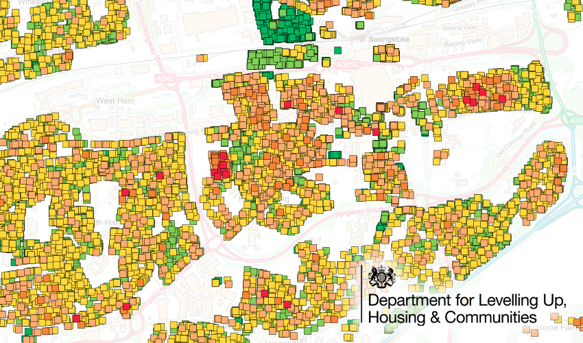
Current EPC Rating
This shows a rating label and coloured block for any record available.

Current Rating Generalised
This is the same as the data above, but generalised to two colours representing A-C and D-G. This makes it easier to see clusters of common property grades.

Potential Score Increase
This shows a calculation between the potential score and the current score, therefore indicating a property's potential to increase. A low number means it can't improve much. A big number means it can improve a lot.

Potential to C
This layer highlights properties that are currently lower than a C, but have the potential to reach a C rating. This works quite nicely when combined with the Current Rating as it essentially puts a blue halo around buildings that can improve to C or greater.

EPC Age
This layer shows the age (in years) of the latest EPC certificate. This can help you identify groups of housing where EPCs haven't been updated recently.

EPC Difference
This shows a point where there's been a new EPC added to the database since our last upload. We've calculated the rise or fall in the energy rating and visualised it as a green and red point.

Where does it come from?
This is a dataset generated by the Parish Online (Geoxphere) team by modifying and combining two datasets:
- OS Open UPRN (locations of properties)
- The Department for Levelling Up, Housing and Communities database of EPC Registers.
How often is it updated?
England and Wales. The dataset will be updated every year based on the EPC data from each September.
Scotland. This is a one-off analysis from June 2021.
What area does it cover?
England, Wales and Scotland
How might you use it?
This dataset might be used for:
- Getting an overview of clusters of houses that have the potential to increase their energy efficiency rating. If there are grants available this will help you focus the efforts to where it will make the most difference.
- Look at individual properties to view the information about the current materials and make-up of the property and see the potential improvements that could be made.
Data Licence
Database works, calculations and analysis are copyright of Geoxphere Ltd.
Underlying data carries the following licencing:
- OS Open UPRN (Open Government Licence)
- EPC Register - non-addressing data (Open Government Licence)
- EPC Register - addressing data (Ordnance Survey and Royal Mail Copyright)
The data can only be used for the following use cases (as outlined here):
- The effective management of properties in the private or public sector with a view to promoting energy efficiency (through consideration of factors such as patterns of use, maintenance, repairs, improvements and upgrades of building structure or energy using systems).
- Research to provide data, analysis and statistics intended to improve the understanding of energy efficiency of buildings or to facilitate innovation and improvement in use, design, materials and equipment to this end.
- Research into the effectiveness or impact of energy efficiency improvements including those delivered through Government or other energy improvement programmes.
- Promoting and marketing energy efficiency improvements that may be made through a Government energy efficiency programme or initiative.
- Promotion and better understanding of the current energy efficiency of buildings and potential improvement in the building sale or rental markets and/or by building occupiers or users.
- To enable enforcement authorities to carry out enforcement duties as required by the Energy Performance of Buildings Regulations (England and Wales) 2012 (SI 2012/3118).
- By local authorities in the exercise of their duties under section 91 of the Building Act 1984, or an approved inspector for the purposes of the inspector’s functions under Part 2 of the Building Act 1984.
- For the prevention or detection of crime, the apprehension or prosecution of alleged offenders, any proceedings in a court or tribunal or complying with an order or a court or a tribunal.
Back to Category
MORE INFORMATION